Interview: Martin Cendreda on ‘An Apple and an Adventure’
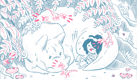
BOOM! Studios has started publishing picture books from time to time, and they are always interesting—every one is different. The latest is Martin Cendreda’s An Apple and an Adventure, an alphabet book that stars a young girl having fun with her animal and dinosaur friends.
 This ABC book has a really old-fashioned look, with an embossed cover, wide page margins, and a two-tone color scheme reminiscent of both old process printing and the more modern risography. And the story itself has some unusual elements—dinosaurs and giant robots? We asked Cendreda about the book and how he made it, and we have some pages to share as well. Enjoy!
ADVERTISEMENT
ADVERTISEMENT
Alphabet books have been around forever. What motivated you to do one? How did you find a new slant on such a classic genre?
The book actually started out as a self published zine. I was just doing it for fun. I was drawing this little girl character and her triceratops friend a lot in my sketchbook. My kids were learning to read at the time. All these things just kind of influenced each other, and out popped this book idea. But there were three books that really inspired me to make it a real thing: The Wonderful Egg by Dahlov Ipcar, Destined for Dizziness by Souther Salazar, and Moke and Poki in the Rainforest.
An alphabet book is usually an early reader, but some of the vocabulary you use in the book is pretty advanced. Did you have a particular age group in mind when you were writing this?
I didn’t have a specific age in mind, so I just used words that I found interesting. I wasn’t too worried about words being too advanced. Parents and older readers can help with that. And besides, it’s good to challenge kids!
Which came first, the words or the pictures?
It was a mixture of both. But really, even when I was writing out sentences I had images and pictures in my mind. And vice versa, when I was working on sketches, I’m thinking of the words in my head. So I guess both really!
A lot of alphabet books cram a ton of objects on the page that start with the featured letter. You take a more minimalist approach—your pictures are filled with details, but only the objects named in the caption start with the featured letter. Why did you decide to go in that direction?
When I was reading to my kids, I found alliterative sentences were always the funnest to read out loud. Also, fun to write.
Your lead character is frolicking with dinosaurs in what appears to be a natural setting, except there are ruins in the distance and dismembered robots in the water. Is there a backstory here? Is this a post-apocalyptic alphabet book?
Back when these characters were just doodles in my sketchbook, I had ideas to put them in a comic where they lived in this kind of mash-up of a pre-historic meets post-apocalyptic world. I prettty much just kept them in that world.
And what’s with the big head on the Y page—what is that???
Haha, that’s the head of a very ancient statue of a long-forgotten race. Very much inspired by those from the Olmec civilization of ancient Mexico.
The look of this book is really interesting to me. You limited it to two colors, and it appears to be printed in duotone, with no blacks. Is that correct?
Yes, just two colors, blue and magenta.
What was your process? Did you work digitally or on paper? This looks like risography—is that the effect you were going for?
I definitely knew I was going to use a risograph to make the zine version. As for the art, I started out with really loose sketches. I scanned those into the computer, and refined them in photoshop and then “inked” them in Manga Studio. Then I brought them back into photoshop to color them.
Why did you limit your palette to two colors—and why these two? Was it just the way they looked side by side or did you also consider how they would mix on the page?
When I was doing the zine version, I was going to do it on a risograph machine that my friend John had. He had a lot of blue and magenta ink, which we knew work very well together, so we just went with that.
The two-color palette and the way the printing is slightly offset give the book a retro feel. Was that something you were going for?
Yes, definitely. I’m sucker for old comics and kids books.
Can you talk briefly about the lettering? It has a hand-lettered look—why did you prefer that to type?
My wife Jenny is a graphic designer, and she helped me try out a million different fonts, but none of them felt right. Hand lettering just turned out to be the best.
And finally, you used wide margins, a cream-colored paper, and am embossed cover with a centered image. All this gives the book a really old-fashioned feeling. Were you modeling it on anything in particular?
ADVERTISEMENT
ADVERTISEMENT
I used to do a lot of comics, so the boxed images probably comes from that. I actually drew out an entirely different first draft, where the drawings were much bigger and denser, but it was getting too unweildly, so I scrapped it and just went for something much simpler. My editor, Sierra, suggested the embossing, which turned out great.
How does your animation work inform your comics, and vice versa?
In animation, particularly in storyboarding, you always want to draw the character with a strong silhouette, which is to say, if you completely filled in the drawing of the character with black, you would still be able to read the pose and action of the character. So I try to use that in comics as much as possible.
The alphabet is something we take for granted—I think we learn it so early that we seldom think about it, yet it’s a structure that permeates our world. What insights did you gain into the alphabet when you were making this book?
I learned that there are not that many words that start with the last letters of the alphabet, X, Y, and Z. Also, it’s really hard to make a sentence with what few words there are!
Filed under: All Ages, Interviews
About Brigid Alverson
Brigid Alverson, the editor of the Good Comics for Kids blog, has been reading comics since she was 4. She has an MFA in printmaking and has worked as a book editor, a newspaper reporter, and assistant to the mayor of a small city. In addition to editing GC4K, she is a regular columnist for SLJ, a contributing editor at ICv2, an editor at Smash Pages, and a writer for Publishers Weekly. Brigid is married to a physicist and has two daughters. She was a judge for the 2012 Eisner Awards.
ADVERTISEMENT
ADVERTISEMENT
SLJ Blog Network
One Star Review, Guess Who? (#206)
“Complex social dynamics exist in the simplest of conflicts.” A Kyle Lukoff Interview on Sorry You Got Mad
Navigating the High School and Academic Library Policy Landscape Around Dual Enrollment Students
Read Rec Rachel: My Most Recommended Library Titles
ADVERTISEMENT
