Interview: Luke Pearson Illustrates a World War I Poem
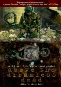
With the 100th anniversary of the beginning World War I, we have seen a flurry of books, including graphic novels, about the War to End All Wars. Above the Dreamless Dead, edited by Chris Duffy and published by First Second, is a remarkable anthology of what came to be called “trench poetry,” poems by soldiers in the war (they were never a formal school, so the term is really a catchall). First Second’s other anthologies, Fairy Tale Comics and Nursery Rhyme Comics, also edited by Duffy, were colorful, light-hearted affairs. This book, on the other hand, is deadly serious. It’s small in format, all black and white, but the combination of poems and graphics is powerful. (Here’s an interview with Duffy about the book.)
When First Second marketing director Gina Gagliano asked me if I would like to interview one of the artists, I leaped at the chance to talk to Luke Pearson, whose Hilda books (Hilda and the Midnight Giant, Hilda and the Black Hound) are some of the most sophisticated children’s graphic novels being published today—and they are the sort of book that an adult can appreciate as much as a child. Pearson illustrated Thomas Hardy’s “Channel Firing,” in which the guns of war literally wake the dead. A portion of the comic is below the interview, so you can see it for yourself.
ADVERTISEMENT
ADVERTISEMENT
Before you started working on this poem, what did you know about World War I? Was it simply what you learned in school, or was there any personal resonance—a family member who was involved or a visit to a particular site, for instance?
To be honest, everything I know about it comes from school and what I’ve read about it since. I never heard any first hand experiences or anything, so it doesn’t hold a personal resonance any more than it does for anyone else.
Did you get to choose which poem you would illustrate, and if so, why did you choose this one?
Chris Duffy assigned the poem to me. I’m sure I could have asked for another one if I wasn’t into it, but I liked it a lot. From the imagery it conjures up, you can imagine it could have been written after the war, or during it, from the point of view of someone who’s bracing themselves for it. It’s very poignant that it was written before war officially broke out and that you could probably write the same poem on the eve of any future conflict.
The speaker in the poem is a corpse in the churchyard who is awakened by artillery fire, and part of the conversation in the poem is between corpses. You depict them very simply. How did you come up with that particular visual image?
There’s a strong comic element to the poem in the way the skeletons/corpses in the graveyard talk to each other. In a lot of ways it’s a poem about grumpy old men being woken up in the middle of the night and shaking their heads about it. A part of me definitely felt drawn to the idea of depicting them as skeletons or as grumpy ghosts or something, but I felt like doing that would undermine the sadness and the atmosphere of the rest of the poem. Like it would add a comic layer to the whole of it, whereas if I avoided showing them like that, the humour in their parts would still come through, but wouldn’t affect the rest. That’s what my thinking was anyway.
I thought that by picturing them as faces that were skull-like but not quite skulls, and were kind of abstractly pictured as being underground, without placing them there physically and literally (I didn’t want the reader to think of them like the living dead, literally moving and speaking in the ground), you would understand who was speaking but it would maintain the feeling I wanted for the poem as a whole.
The poem uses quite a bit of concrete imagery in the second stanza, yet you render it almost abstract by using tight close-ups on the mouse’s eye, the worms, the cow’s drool. Why did you choose to do that?
A lot of people would agree that having the text and imagery do the same job inside a comics panel is pointless and with poetry it seems even worse than that. It seems like by adding the imagery, you’re locking the words into one interpretation and robbing the poem of some of its layers and power. I think my overall feeling was that I should back off and let the poem do its thing. Most of the imagery is pretty literal really, but I tried to portray everything in a non-direct way that was more concerned with creating the right atmosphere. For instance, a big black eye felt more appropriate than showing a full mouse nibbling on crumbs inside a church.
I was inspired quite heavily by alt manga artists like Seiichi Hayashi and Oji Suzuki, as I always thought there was something poetry-like about the way their imagery doesn’t always have an obvious logical connection from panel to panel. Like it feels more evocative of a place or an idea, rather than telling a point to point literal story. So I guess once I decided that the images didn’t need to be a ‘sequential narrative’, it freed me to think about what imagery I really wanted to pair with any given line (or portion of a line).
ADVERTISEMENT
ADVERTISEMENT
One thing that must be a challenge when making a comic from a poem is pacing. How did you figure out how to break up the lines into panels as well as how many panels to a page? I notice that varies quite a bit in your short piece.
Part of it came from reading it aloud. There are parts where you naturally slow down or feel obliged to pause for effect, and that came into it. But then there were also parts that I felt strongly inclined to give weight to by way of dedicating more page space to them. For instance I knew pretty early on that I wanted to give the whole first page to the first couple of lines and present it the way I did. I wanted to break the following few lines up quite heavily, to keep the reading slow, because I felt like those lines create a great atmosphere and I didn’t want to skim over them. But then there’s more text per panel in the section where God is chuckling to himself about the apocalypse because that section didn’t evoke that much imagery that I was interested in and I didn’t mind giving less space to it. I was locked in to six pages, so like the process of planning any comic out, it was mainly about being economical and figuring out which parts I wanted to emphasise most.
In the last stanza, Hardy mentions three places. They all have strong associations with British history, and you fill two of them with knights, but you leave Stonehenge alone in an unpopulated landscape. Can you explain what your thoughts were about that final page?
That last stanza seems to emphasise the tragic inevitability of continued bloodshed by evoking this idea of the sound of the guns echoing back through history, perhaps infinitely. I think in the poem, Stonehenge represents unknowable and mysterious prehistory, while keeping things rooted in the recognisable English landscape. It just kind of made sense to portray it like that. Like the church at the start of the poem, it’s a quiet, lonely scene that seems far removed from the battlefield, but is still disturbed by sound of war.
Filed under: Interviews
About Brigid Alverson
Brigid Alverson, the editor of the Good Comics for Kids blog, has been reading comics since she was 4. She has an MFA in printmaking and has worked as a book editor, a newspaper reporter, and assistant to the mayor of a small city. In addition to editing GC4K, she is a regular columnist for SLJ, a contributing editor at ICv2, an editor at Smash Pages, and a writer for Publishers Weekly. Brigid is married to a physicist and has two daughters. She was a judge for the 2012 Eisner Awards.
ADVERTISEMENT
ADVERTISEMENT
SLJ Blog Network
Name That LEGO Book Cover! (#53)
Cover Reveal and Q&A: The One and Only Googoosh with Azadeh Westergaard
Fighting Public School Book Bans with the Civil Rights Act
Take Five: Middle Grade Anthologies and Short Story Collections
ADVERTISEMENT

